


Zero trust third party risk management platform
SaaS
B2B
Cybersecurity
Making risks visible and actionable.
I joined Lema.AI at inception, when the product had no established UI, UX, or brand direction. I was brought in to define the end-to-end product experience and visual identity, working closely with engineering and leadership to turn early ideas into a usable, scalable AI product.
Outcomes:
-
A scalable inventory that allows our users to navigate thousands of third parties
-
Designed the core flows of a SaaS from the ground up
-
Led our visual identity, building components strategically
Context

What is Lema?
Lema is cybersecurity startup that helps medium to large organizations manage their third-party risk posture (e.g. potential for data breaches via a third party).
Real-life example: the SolarWinds breach, where a compromised vendor gave attackers access to thousands of organizations at once.
To mitigate risk, organizations need visibility into their third party risk posture.
Context
Lema's third party inventory is its heart, evolving as the company grows.
Lema.AI helps large organizations mitigate third party risk using open-source intelligence and LLM document analysis.
Problem
When I joined, there was no product or branding at all.
Our users needed visibility into their third party risk posture.
As our data and use cases and data grew, without strong UX/UI, things could quickly spiral out of control.
Goal
Design the third party inventory from the ground-up. It's a core screen that allows our users to navigate thousands of third parties.
Evolve the interface and flows as the product matures and use cases diversify.
My Role
At the beginning, there was nothing.
Not even a design partner.
As the first employee and sole designer, I wore many hats and shaped product vision a lot, especially at the beginning. In the first year, I doubled as a product manager and owned multiple features end-to-end:
-
Collaborated closely with product managers, designers, and engineers to design new features from early discovery through wireframes, high-fidelity prototypes, and developer handoff
-
Led the management and evolution of the design system, including aligning Storybook with frontend implementation to improve consistency and speed
-
Defined and documented UI and design standards to support a more cohesive, professional product experience
-
Proactively identified product and UX improvements informed by user feedback and competitor research
-
Lead designer for marketing initiatives, creating scalable Canva templates and designing conference and
event assets

Marketing Brochure
I led marketing and branding.
(Above) A comparison matrix, and a features brochure.
These were sent to clients and given out at conferences.

Discovery & Research
Especially at the beginning, I prioritized understanding our users' needs and the market to form our product vision.
In addition to speaking directly to our champion users (third party risk assessors), I understood the third party risk management (TPRM) market with the following sources:
-
Books
-
Industry non-profit organizations (TPRA)
-
Guidebooks
-
Webinars
-
Our competitors
-
Free competitor demos
-
Video presentations of competitors
I collected screenshots of our competitors' products and flows from their youtube videos and free demos.
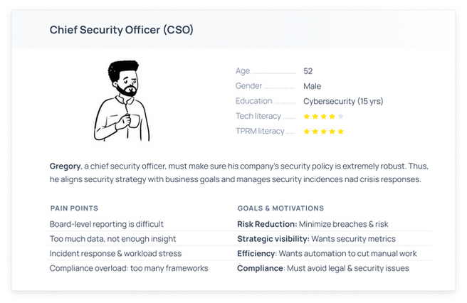
Who are our users?
Based on my research, I defined 2 primary user personas.
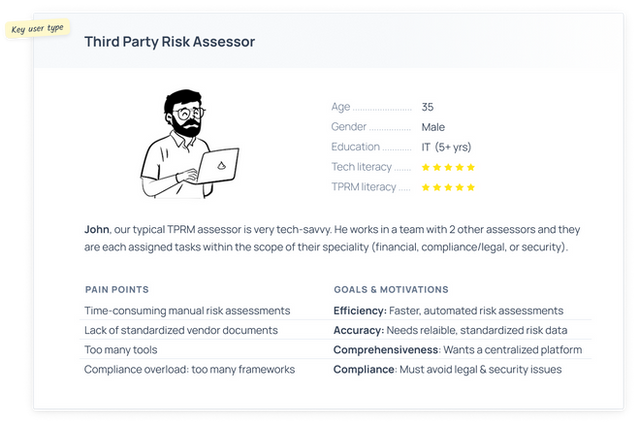
User journey of an assessor


Scenario
There can be around 5000 third parties. For compliance, John has to give each one a risk score, and to mitigate risk, he must prioritise his third party assessments by risk.
Use Cases
-
“I need to score each of my third parties’ risks”
-
“I need to prioritize my third party tasks by risk”
-
“I need to investiate third parties with risky items”
-
“I need to have all of this documented and in one place to comply with regulations”
Wireframes
Design thinking question:
How can we let users explore their third parties to find the riskiest ones?
I use wireframes in the ideation process to align the team. At this point, I had defined what features the minimum viable product should have, and so the wireframes are to hammer down the visual hierarchy, flows, and components.
Features:
-
Actionability:
-
Inherent risk and open findings help the user decide which action to do next (which third party to assess)
-
Tables display data in an easy-to-compare way
-
-
Inherent risk is automatically calculated and updated
-
Inventory is sorted by inherent risk by default
-
Users may sort third parties by other parameters
-
Third parties are automatically added to inventory by integrations to make it a single source of truth

Emphasizing the actionability of the inventory
When I approach design for SaaS, I don't want to just display data - I want to push our users along their user journey. I add actionability that says "here's what you should do next".
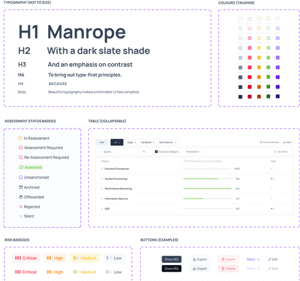
Highlights from our components library
Branding
Minimalist + bold blacks + traffic light colours
With no starting screens, from a design strategy perspective, I made some key choices on how colour and typography should be used going forward.
I decided on a traffic lights palette: among huge quantities of data, our users will always be able to scan for:
-
Red = scary, green = good
-
Purple or dark is a call-to-action

Slides from our customer-facing deck
First Iteration

We could not offer much data, but since the secondary goal was to attract more clients, to prevent it from looking too empty, I added infographics our partner CISOs had requested.
Evolution of the product
Growth pains: too many columns & data
Growth pains: too many columns & data
As our backend capabilities grew (new data!), so did our understanding of use cases. Some issues on the inventory page became clear to me:
There are too many columns and data, making the
page confusing
Our inventory was not supporting users along the differing user journeys they had per third party status
User analytics:
Through analyzing session recordings and usage analytics (DataDog, Hedgehog), I observed our champion users were almost always using small notebooks, which have very limited horizontal space.
So, I prioritize horizontal space in my designs:
-
Menu items are along the top instead of on the side
-
It's important to reduce the amount of columns
-
Horizontal scrolling is terrible, so I avoid that

As we got more data, I removed the infographics because they didn't serve assessors and we needed space. The new issue was that we had too many columns on one page.
New design thinking question:
How can we support each use case while keeping the inventory UI clean?
Final Interface
Leveraging use cases to streamline the interface
The Solution: View by Assessment Status
Since the use cases for each third party depends on its assessment status, I segregated the table into views by assessment status .

'View by' tabs at the top change which columns are shown, to support the use cases for each assessment status.

Examples of different columns per view.
Top: 'Assessment Required', bottom: 'In Assessment'
A UI focused on the user journeys
Each view only shows data relevant to the user journey of that assessment status
I added columns for each view that are specialized to
the user journey
Specialised cells are actionable (e.g. navigates to an
ongoing questionnaire)
Example: If the third party requires an assessment, users want to know basic information and start an assessment. But if the third-party is in assessment, the user will want to know the progress of the questionnaire up-front, and go to the questionnaire in one click.
Conclusion
Users Love Lema's UI & UX
Reduced time spent on inventory screen by 56%
Attracted design partners and 15+ clients before round A
Defined Lema's branding
Iteratively evolved our product with data-driven decisions
Designed custom components to support unique use cases
Created design guidelines & components

Inherent risk flow & compliance table
Other Highlights

Third party company profile

Risk configuration settings

Risk dashboard

Integrations catalogue
Final Thoughts
Designing Lema’s product from scratch has been an amazing experience.
My favourite part is analysing the evolving needs of our users, and then adapting the product to support them. It’s really satisfying to monitor product KPIs to see a tangible improvement in our UX.
